iOS 26 and iOS 27
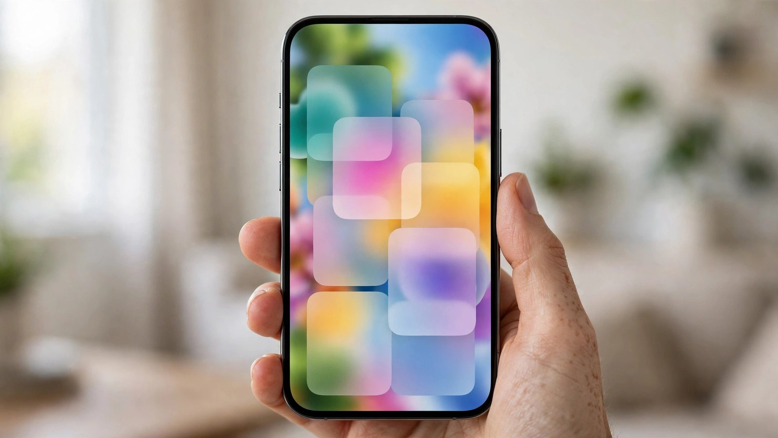
Liquid glass too hard to read is a complaint we hear constantly, and it is a fair one. Since iOS 26, menus, buttons and notifications sit on see-through panels, and your wallpaper shows straight through them. A notification over a bright photo can turn into grey text on a pale blur. You are not imagining it, and you are not stuck with it.
On iOS 27, open Settings, Appearance, Liquid Glass and drag the slider to the right for more tint. On iOS 26.1 or later, open Settings, Display and Brightness, Liquid Glass and choose Tinted instead of Clear. If that is still not enough, turn on Reduce Transparency in Settings, Accessibility, Display and Text Size.
The fix depends on your version, because Apple moved the setting between releases. Open Settings, General, About and look at the iOS Version line. If it says 27 point something, use section 2. If it says 26 point 1 or later, use section 3. If it says 26 point 0, update first in Settings, General, Software Update, because the dedicated Liquid Glass control did not exist until 26.1.
On iOS 27, Apple turned the two-way choice into a slider and gave it a new home. Open Settings, Appearance, Liquid Glass. Drag the slider to the right to increase the tint, and to the left to make the glass more clear. Start around the middle, then open a notification over your usual wallpaper and see how it reads. Push it further right if your wallpaper is bright or busy, because that is where the glass washes out worst.
One catch is worth knowing before you start. Apple notes that if you turned on Reduce Transparency or Increase Contrast in Accessibility settings, you need to turn them off to change the look for Liquid Glass. So if the slider seems stuck, check Settings, Accessibility, Display and Text Size first. Turn those two off, set your tint, and then decide whether you still want them on.
There is no off switch for Liquid Glass. There is a slider, a tint, and a set of contrast controls, and used together they fix the reading problem for most people.
On iOS 26.1 or later, the same control is a choice rather than a slider. Open Settings, Display and Brightness, Liquid Glass and choose between Clear and Tinted. Clear is the original look, full transparency with your wallpaper showing through everything. Tinted adds opacity to the material in apps and in notifications on the Lock Screen, which is what Apple says it does in its 26.1 release notes. Text stops floating over your wallpaper, and buttons get a solid edge again.
Try Tinted for a full day before judging it. It looks heavier in the Settings screen than it feels in real use. In normal use, the difference shows up where it counts: notifications you can read at a glance, and a Control Center that does not fight with the photo behind it.
If the tint alone is not enough, the Accessibility settings are the stronger fix. Open Settings, Accessibility, Display and Text Size and turn on Reduce Transparency. Apple describes it plainly: it improves contrast by reducing transparency and blurs on some backgrounds. In practice, the see-through panels become solid. This is the closest thing to turning the glass off.
While you are on that same screen, turn on Increase Contrast too. Apple says it improves color contrast between app foreground and background colors. The two settings stack. Reduce Transparency makes the panels solid, Increase Contrast makes the text and buttons stand out against them.
You will see videos and posts promising a hidden switch that restores the old iOS 18 look. There is no such switch, and Apple has never shipped one. What exists is the tint control, Reduce Transparency, and Increase Contrast. Anyone selling a one tap fix is selling a shortcut that does not exist.
Sometimes the glass is only half the problem, and the text is simply too thin for your eyes. On iOS 27, open Settings, Appearance, Text Size and drag the slider right a notch or two. It changes the text size in apps that support it, which covers Settings, Mail, Messages and Notes. On the same Appearance screen, turn on Bold Text. Thicker letters hold up much better against a busy background than thin ones.
If you need more than the normal slider allows, go to Settings, Accessibility, Display and Text Size, Larger Text and turn on Larger Accessibility Sizes. The slider then goes further, and it applies across the apps that support Dynamic Type.
For some people the menus are fine and the Home Screen is the problem, because the icons themselves are glass. In iOS 26 and later, touch and hold the Home Screen until the icons jiggle, tap Edit, then choose Customize. If your icons are set to Clear, they are translucent panels over your wallpaper, and app names can disappear into a bright photo. Switch them to Dark for a solid, darker icon set, or Tinted to recolor them in one calm tone.
Your wallpaper is doing half the work here. A bright, detailed photo behind glass icons and glass widgets is the hardest combination to read. Pick a darker, simpler image for the Home Screen, and keep the bright photo on the Lock Screen where it looks best.
Start with the Liquid Glass control itself: the slider on iOS 27 in Settings, Appearance, Liquid Glass, or Tinted on iOS 26 in Settings, Display and Brightness, Liquid Glass. If the control seems stuck, turn off Reduce Transparency and Increase Contrast first, set your tint, and then turn them back on. Add Bold Text and a slightly larger Text Size, and swap Clear icons for Dark if the Home Screen is the worst part.
How we check this: every step above was traced to Apple's own pages, "Adjust iPhone display and text settings" in the iPhone User Guide and "Use display and text size preferences on your iPhone, iPad, and iPod touch" on Apple Support, plus Apple's iOS 26.1 release notes for the Clear and Tinted choice. If Apple does not publish it, we do not print it.
Grab our free live wallpapers and pick a darker, simpler design for your Home Screen. A calm wallpaper under tinted glass reads far better than a bright photo under clear glass, and it takes two minutes to try.
Get the free live wallpapersMore useful reading: our iOS 27.2 guide walks through what else changed in the latest update, including the new Appearance menu where the Liquid Glass slider now lives.
 iPhone Visuals